Data Visualization: Unlocking Intelligence in BI
- Home
- Blog
 Bhushan Sardesai
|
Oct 27, 2020
While organizations are trying to redefine their reporting processes through BI platforms, a structured approach towards building intelligent data visualizations will help them achieve success.
In our experience, intelligence rests on the ability of the dashboard to: .
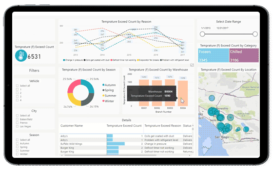
- Tell the viewer whether the numbers signify good news or bad news, the extent of it as well as ownership of the same.
- Present KPIs in their most suitable form (Raw Numbers / Progress / Variation Across Time).
- Drill down to the root cause of the problem.
Read the article to understand Saviant’s structured approach towards Business Intelligence projects.
Although the adoption of data visualization is becoming more widespread, intelligence remains elusive. Most projects begin with high hopes of completely transforming existing reports but simply end up with good-looking versions of the same.
This can be attributed to two key challenges.
The Business - IT dilemma
The first important challenge organizations face is the pervasive nature of BI Projects. This applies to business as well as IT equally. Hence, defining who drives this transformation and how to establish balance is critical. Organizations where the activity is completely business driven fail to bring a fresh perspective. Similarly, an initiative driven primarily by IT is a recipe for expectation mismatch.
Execution team composition
Another challenge is getting the right combination of functional understanding, design thinking and technology expertise in the team. Traditionally, business requested for reports and IT fulfilled the request. However, in the modern scenario, BI Tools have changed the game and with a clear understanding of the three components mentioned above, IT can add significant value in the entire reporting process.
A recent requirement which had a long list of reports to cover multiple data points across organization hierarchy was cut down by 30% when business team was shown AI based capabilities of the reporting platform.
There is no framework for success as the transformation journey is more art than science. However, based on our experience with global enterprises on BI engagements, the following guidelines of dashboard design can definitely help to ensure a smooth sailing.
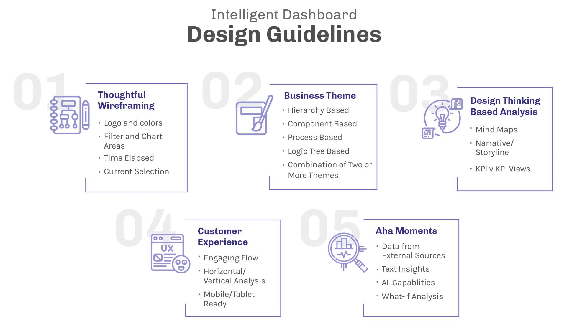
Thoughtful Wireframing
Wireframe describes the basic structure on which each dashboard page will be built. For BI Teams, this is the first thing which they need to get right. A clean look will ensure that the viewers feel comfortable and a great first impression is made.
A well-positioned logo and a complimentary color scheme works well to give the dashboard a feel of an internal collateral. Additionally, a clearly separated filter pane and chart area directs the user to provide inputs through filter selections and view the effect simultaneously in the output or chart area. In a visualization setting, context of the information is as important as the information itself, if not more. For instance, knowing the last updated date is crucial to figure out whether the numbers are good or bad. Report viewed on 15th of a month where the data actually got updated on 5th will result in uninvited action. Likewise, showing the current selection of filters in textual format at the top of the page will make the dashboard experience even more cohesive.
Business Theme
Business theme provides a comprehensive view of data surrounding a specific business purpose. Given the many interrelated data points, it is crucial to stick to one specific theme or a right mix of themes for one dashboard page. In a theme setting, viewers are fully aware of the context and hence are able to identify red flags easily further driving quick actions.
A theme focused on component based variance in sales, for instance, can help the viewer identify markets, products or regions that have missed performance targets, thus, making way for specific drill down analysis to nth level of detail which might include looking at sub-regions, states, cities in case of region hierarchy. Likewise, process focused theme in a production setting will help the plant manager to identify progress as well as bottlenecks in real-time. Such visibility into tasks across multiple assembly and sub-assembly lines can be used to optimize efficiency and impact.
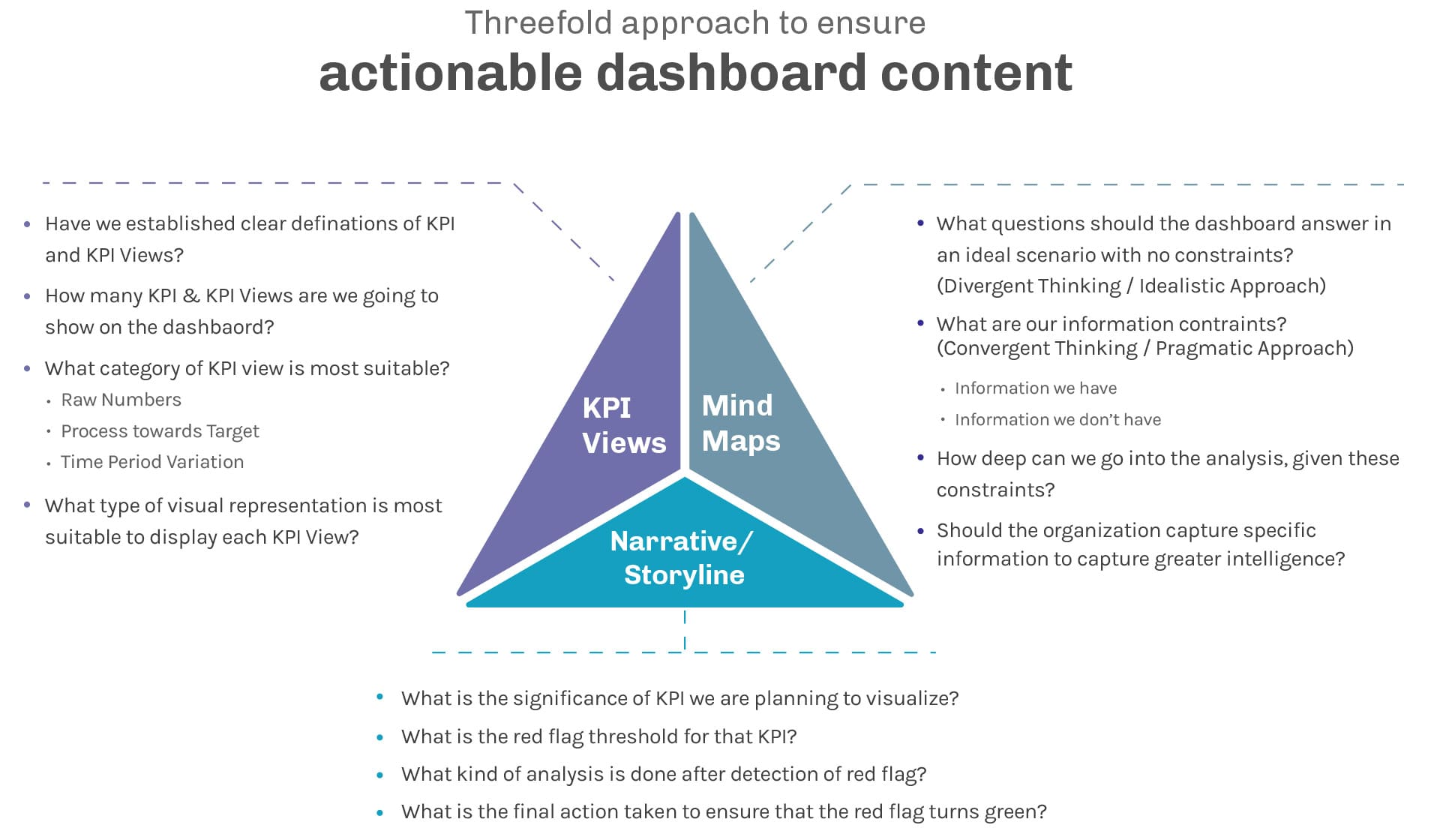
Design Thinking Based Analysis
It is fairly easy to come up with charts to visualize data. The harder part is to decide what should be visualized. Often, data visualization teams study existing reports and try to bring the same KPIs through a one to one mapping approach. This fails to create the expected impact and ends up becoming a case of old wine in new bottle. Real value can be captured by following a threefold approach. This ensures that the objective of actionable insights is achieved to the satisfaction of relevant stakeholders. There is also an additional ingredient required to succeed in analysis:
-
Iterative Approach
Moving away from existing reporting processes to a new visualization platform is a transformation journey which is more art than science. Every organization is different with different people and different mindsets. The only way forward is to learn by experience and apply this learning to make further improvements.
Customer Experience
An exceptional customer experience encourages viewers to immerse themselves into the story. Central to achieving this feat is putting together a seamless flow that will allow viewers to engage with the dashboard.
Often, a dashboard is imagined as a combination of charts available on one single screen with the ability to answer all questions. However, customer experience can be enhanced by starting with the objective big picture on the first dashboard page and allowing the story to unfold in subsequent, connected dashboard pages.
With admin analytics component of BI tools, the team can easily understand customer journeys and realign their dashboard design as required.
Aha Moments (X-Factor)
The X-factor component refers to those AHA moments which address unmet needs in the most efficient and convenient manner. X-factor insights offer not only a fresh perspective to look at existing data but also ensure that time taken is in seconds instead of a few days and few people. For instance, the head of sales can quickly check different clusters (geography, demography, product category, sales representatives) that caused returns and follow the workflow within the report to get to the last level of detail. Likewise, an executive level employee can simply look at the textual summary of exceptions to quickly capture the essence of the dashboard. With dynamic filters affecting these insights, one can imagine the value that can be created.
Conclusion
While the availability of BI Tools offers a great way to transform existing reporting processes, it is worth noting that the tools are just the enablers. The real intelligence comes from the thought process and structured approach adopted while building the reports. The right combination of both can arm organizations with real competitive advantage across roles and hierarchies.